In this article, you are going to learn how to use charts in Microsoft Office Word 2016. Here use the charts to show the improvement, progress, increases, and decreases, at all charts are going to show you the changes or deferences in particular time. If you are the chairman of a company and you want to know signs of progress of selling in your company or you are working in finance than you want to show that how you spent in twelve months of one year, you need to show it in chart, because though the chart you can easily show the degree that, it increased or decreased in one year.
Here we have many steps from the first till the end, read them carefully to learn completely this part of Microsoft Word.
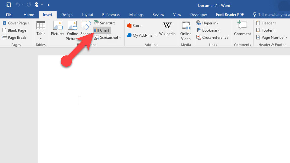
#1. Click Insert tab to Use Charts in Microsoft Office Word 2016
Apparently, option chart has a small figure in Insert tab, but it can solve a big problem of your documents or your information. Now click on this option.
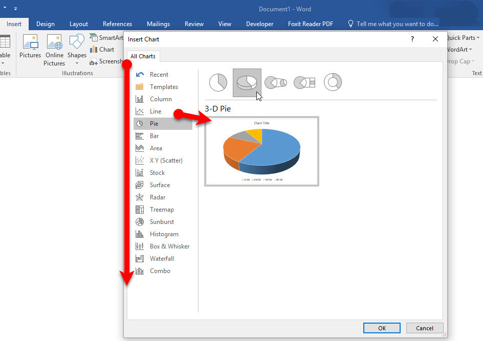
#2 Insert Deferent types of Chart
When you clicked the options chart, you see this new page which contains deferent types of chart, like Column chart, Line chart, Pie chart and etc. you can use them for deferent reasons, according to your Document or your information, you can select the chart which depended on, then click OK.
#3. Insert your Data in these Tables
When you select your favorite chart after clicking on that you will see a new window like excel which has named Chart in Microsoft Word. here you can Insert your data to see the result on the chart. In this new window, you have enough tables for your data, when you write completely your data, your data directly will insert in a chart and when you finished you can close the date window and design your chart.
#4. Design Your Chart as a Favorite or Change the Position
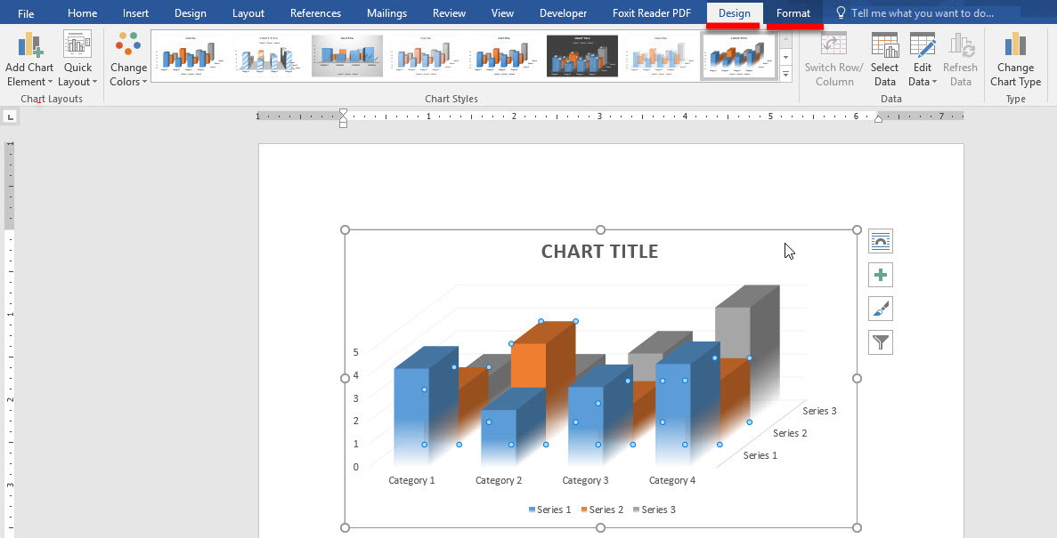
When you Inserted your Data and closed that window you see your main page here you can bring some changes for your chart. Tow options you have on the top of your page.
- Design
- Formate
Design: In this group, you can bring some basic changes for your chart. For example, you can change your data, type of your chart, colors, and style of your chart. To use each of them you can click on them and make a deferent chart.
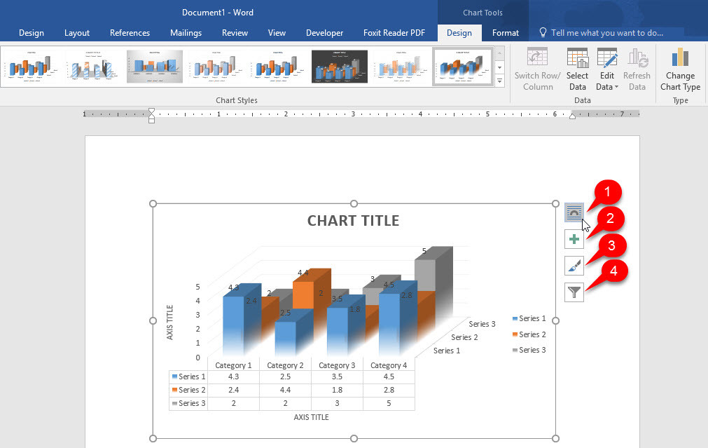
But here you have some other options that you need every time, on right side of the chart you have these options
- This option you can select the position of you chart inside a text if you use this chart in a book or inside any magazine you can select the position of the chart from here.
- In this option, you can add or remove the information or the numbers that you see on the chart.
- Here you can change the color and style of your chart.
- But here you can Filter your chart. I mean here you can change your data and remove some of them and add new data, sometimes when you want to update your chart this option is a good option to update.
#5. Through the Format Tab Bring some General and Basic Changes in your Chart
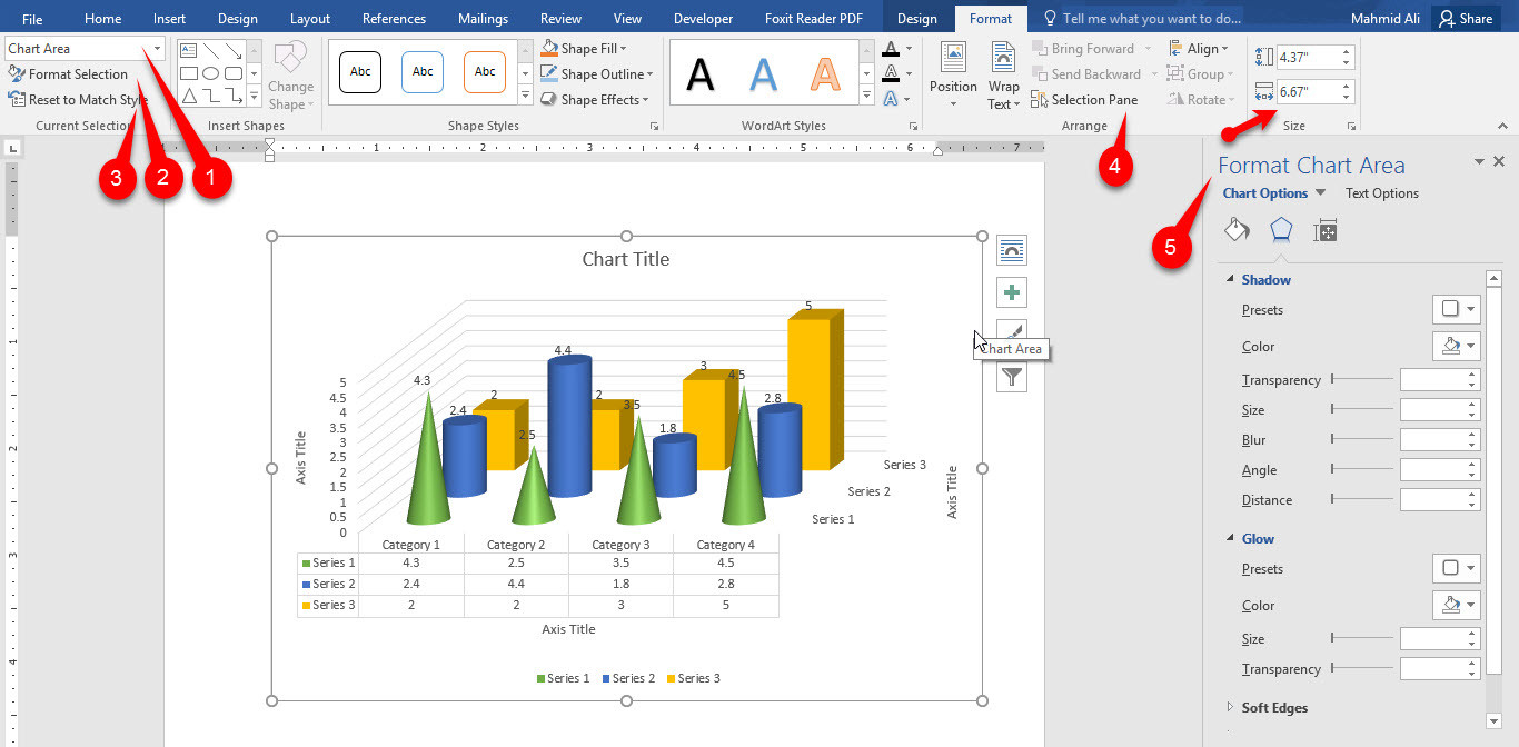
In this tab, you have some other options that help you to edit your chart. The options which have signed. They contain some other options that each of them has their own task. Now see the explanation
- Chart area contains all the parts that you need them to use for your chart when you want to change them first select one of them then go to next step.
- Format selection opens a new page on the right side this page is from that option that you selected in the chart area.
- Reset to Match Style removes all changes that you brought to your chart and give you your first chart.
- Selection Pane Hide your selected chart when you have more then one chart in one page and to hide one or tow of them you can use this part.
- This page is opened when you clicked on Format selection you can bring all your changes here.
Conclusion
It was all about using charts in Microsoft Office Word 2016. You can use charts in Ms Excel also but mostly you need to use them in Ms Word. Use Charts in Microsoft Office Word 2016 to share your census or statistics in your topics, books or other projects.


Leave a Reply