In this article, we are moving to learn that how to use advanced charts in Microsoft Excel 2016. As you know we have learned about how to use charts in Microsoft Word 2016. In Excel Tutorial we have the same situations with a bit different. The difference is this that in Microsoft Excel we are using workbooks or worksheets for our projects. And through to that, we have cells and this cell helps us to use charts for each item Separately. With different styles and statistics, you know that in each official projects and seminar to show our facts and figures, or the line of increasing and decreasing we need to use charts. Using charts in these kinds of the case can solve the problem.
Make your Table to Use Advanced Charts in Excel Worksheets
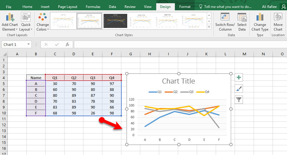
Step 1. Here I made a chart from Student’s Exams, they have four final exams in four years. According to their exams marks, we make their charts. To show their increasing and decreasing in these four years of University. To apply charts on your table at first, select your table then go to Insert tab and select a chart then click on the chart. Your new chart will be beside of your table.
When you make this charts beside the other tabs you will have two new charts, Design and Format. Through to this tabs, you can select many different charts for your table and you can change the colors and the format. Here on the chart, you have each exam with a different color and within the numbers, you can see the increases and decreases.
Use Advanced Charts Separately for Each Item
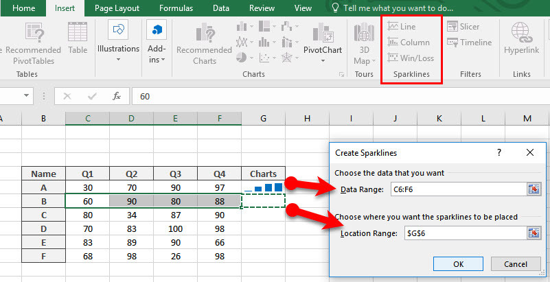
Step 2. Now you can use this chart with the same statistic separately and you can put this charts beside each person on the same line. To apply the charts at first, delete the old charts and go to Sparklines options. This option contains three items and each item used to apply several charts for your table. Now you can click on ideal options through to Sparklines. But first, you should select the marks one person then click on the sparklines. On the sparklines window, you have two places, the first place is for marks which have already filled and the second place is the position of your charts which you can determine it right now. Then click OK to make your chart
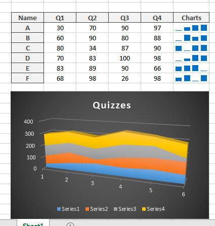
Step 3. Now you know that how to make the chart separately for each item and how to make chart generally. But it’s important to know that, when you make a chart for one item and you want to make for the next also you don’t need to follow the process and do this process for all. Just click on the current chart and take from the corner of the chart and pool it down for other items. And when you bring some changes on numbers of each item the chart will be changed automatically.
Here you can easily change design and styles of your chart, you have many different styles with different colors. Here you can directly click and apply the new style.
Conclusion
It’s all about how to use advanced charts in Microsoft Excel. When you want to show your statistic and decreases and increases in your projects. As you know I explained how to use charts in Microsoft Word, But here we have some more options for drawing or making our charts. Here I explained the article in three steps and shorter than using charts in Word 2016. Now follow us for more articles about Microsoft Excel, and other Office package tutorials.


Leave a Reply