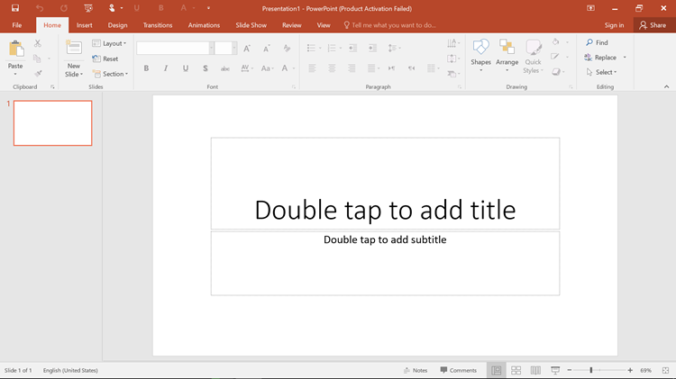
Before explaining bars once have a glance at the following picture. When you double click on any of the templates you will see the following screen. As I have opened the blank page. Read all the texts written about Status Bar in PowerPoint, Title Bar, and ribbon. Let’s start Introducing Microsoft PowerPoint 2016 User Interface.
Introducing PowerPoint 2016 User Interface
Note: The important things are highlighted with the blue and red boxes and numbers.
The top of power point screen is called title bar. The title bar is containing;
- Quick access toolbar
- Window Management
- FileName
#1. Title Bar
location: The top part of the power Point window is called title bar.
It is the bar which is in the top window of PowerPoint. The first square is the quick access toolbar: the quick access toolbar do some quick actions that you have added, or it is from the first, the back, forward, save and play slides are the tools that are added to making your work easy.
The second square is for the window management that maximizes, minimize and close the power window.
The third square is for your presentation name whatever you give the name that will appear on there.
#2. Ribbon
location: below the title bar.
The ribbon is below the title bar containing tabs and groups.tabs: File, Home, Design, Animations, transition, Slideshow, View, Review groups: Clipboard, Table, Font, Editing, Shapes, contain a paragraph, drawing, Timing, themes and more.
#3. Status Bar
location: The lowest part of the power point window is called status bar.
The status contains some shortcuts of zooming if you have a desktop or view shortcuts if you have too many slides in one presentation.The following picture is the look of the status bar.
![]()
The first square is the view shortcuts that you can view the slides in many different ways for examples you can see four slides in one window and more.
The second square is the zoom slider if you have a desktop you can zoom in and zoom out from the zoom slider.
The third square is the slide counter, as many slides you add the slide counter will count the slides.

PowerPoint 2016 User Interface
IF you have any question about Microsoft PowerPoint 2016 interface comment below the post.


on the window management area what is the icon to the left of minimize do?