In this article, I’m going to give you some information about building a mobile-friendly website.
- Mobile first design
- Work out the pros and cons of dedicated design and responsive design
- Consider the benefits of a mobile app over a website
- Know your users – are they on mobiles or desktops?
- Make Google work for you
- Understand that speed, simplicity and stand-out appeal are your three priorities
Build Mobile-Friendly Website
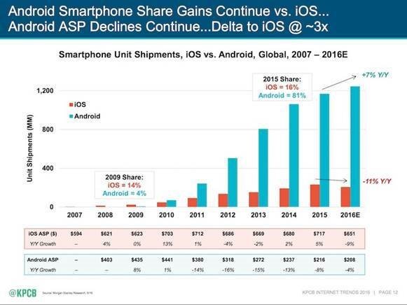
It’s likely that you’re currently reading this article on a mobile device. And because you’re still reading, we take it that the page has displayed properly and the text is easy to read. Behind this webpage, however, and all the others on this site and millions of sites, however, there is some innovative technology at work to ensure your experience is the same whether you’re using a PC with a 4K monitor or a tiny 4-inch smartphone. It’s one of the reasons why more people are now accessing the internet using mobile devices than PCs.
A Graphic Demonstrating the Rise of Mobile Internet Usage
We’re still using technologies like HTML to create pages, and the days where everyone had a square laptop or computer screen that was probably 1024 x 768 in pixel resolution made it pretty easy to have a single website that was compatible on every device available 15 years ago.
We’re also slowly but surely moving away from computers, and doing way more on the move, using our smartphones. 1 in 10 adults in the UK now has a smart device of some sort. So what’s the magic behind websites that can transition so smoothly from laptops to smartphones without any stretching, blurring or misalignment – and what do you have to consider to design one yourself?
Why Design is Your Most Important Feature
In a world where 2 million new pieces of content are produced every day, everyone needs a way to stand out from the crowd.
777.com is a great instance of a website with a unique design. In a world of websites that feature bland virtual gaming rooms or slot machines, this website stands out thanks to a carefully chosen nostalgic feel.
With its authentic retro design, engaging gameplay graphics and real-time interaction with professional dealers and other players, it combines a compelling vintage theme with modern user demands. It creates a feeling of nostalgia with its 1950s feel that takes you straight back to Vegas in its heyday. The abundance of colour contrasts in an eye-catching way with the black-and-white photographs adorning various Web pages.
To see what we’re talking about, you can check out this masterful theme, design and navigability now at 777 online Casino.
The Pros and Cons of Dedicated Design and Responsive Design
Dedicated websites are the best in terms of quality and functionality, but you’ll need to have a decent-sized budget to hire someone to build these sites for you, and you may need to manage separate websites that need to look the same.
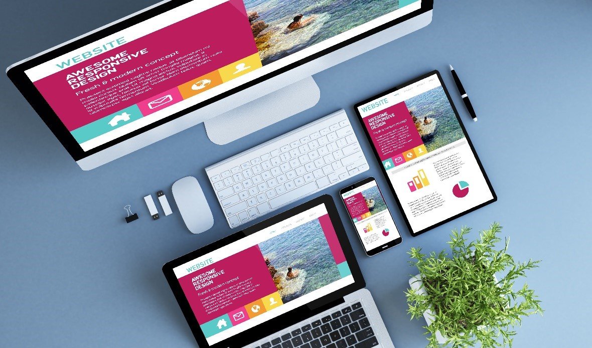
The other option is to go for a responsive design website. This means that a web page will scale automatically to the screen size using a code, displaying exactly the same information as you’d find on a website you’d visit from a Mac or PC.
Fundamentally, responsive web design is recommended by Google – the tech giant which will measure your site on various metrics (including now user experience) to decide where it will rank among your competitors. Google even goes as far as to say that responsive web design is the industry best practice because it has one URL and the same HTML, regardless of the device it’s being viewed on – making it easier for Google to crawl, index and organize content. Google also prefers responsive web design sites because they are easier for viewers to share, engage with and link to content from a separate mobile site.
Responsive-design sites are generally faster loading, and time efficient – as managing one site and one campaign is easier than doing it twice; once for a desktop site, once for a mobile site.
Conversely, a mobile site that has a different URL and HTML code than its desktop counterpart is effectively doubling Google’s workload, as it will have to crawl and index multiple versions of the same site.
The Pros and Cons of Mobile App and Mobile Websites
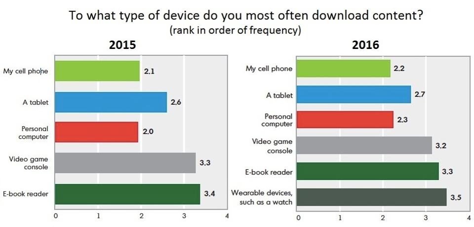
Devices ranked based on how often they were used for consuming digital content
Source: Limelight
Native apps and web apps are the two options out there for developers.
A web app is usually configured by using HTML5, CSS and JavaScript. It needs internet connectivity for it to function. Web apps are accessible via the device’s browser, this means that they do not need to be downloaded onto the user’s device to be accessed. This is one of the key advantages of web apps – as well the fact they don’t need to be installed saves the user memory and data on their device.
A native app is written in a language that’s specific for an operating system. These apps are available via the various online stores, such as the Apple App Store. A native app is installed on the device directly and it is developed for one particular mobile operating system. Native apps are considered by many to be the best way for websites to connect with their audience, as the user only has to click an icon on their screen to use it, and the website can send a push notification to encourage the user to engage further with its content.
The downside to native apps is the often prohibitive design and implementation costs, as well as the fact that a user will have to download them. For companies that don’t have the money to spend on an app, then a web app is a more cost-effective solution.
The Pros and Cons of Mobile Sites and Desktop Sites
Mobile websites are generally more focused than their desktop equivalents, as they’re generally free from on-page adverts. While desktop-based websites have more real estate to play with on-screen when it comes to game design, mobile websites use their relatively small space to create a more intelligent, minimal user experience. One huge advantage of using a mobile site is that you can do it discreetly, while you’re on the move, wherever there’s a good data connection or Wi-Fi signal.
Mobile and desktop users also have different behaviours – so you really have to keep your audience in mind when you’re choosing whether you’re prioritising one or the other.
Getting on the Right Side of Google
Simply put, Google runs the show when it comes to getting more traffic to your website. Here are just a few reasons why:
• 75% of SEO is off-page and 25% is on-page
• 91% of US internet users search on Google every month
• The top 5 results get 75% of the clicks
Google has shown how serious it is about improving the user experience behind mobile sites with its Separate Mobile Index, which splits mobile sites away from desktop ones in order to keep the index more up to date and easier access.
And it’s also introduced Accelerated Mobile Pages (AMP), an open-source project aimed at creating a better world for mobile-only creators in terms of quicker page creation and instantaneous loading. To get on board with this, you’ll need to maintain at least two versions of any article page – the original version of your article page, and the AMP version.
Summing up
Having the right website is the difference between having a web presence that can add an additional revenue stream or just another bland website that blends with the crowd without contributing any additional value. Although it’s a continuous battle as improved devices and technologies come along, it’s worth the pain when your website is responsible for a large chunk of your revenue.


Hi All im rookie here. Good post! Thx! Thx!
I’ve always thought that wordpress mobile theme will do the magic for mobile friendly website